GEO Typeface
6TM Magazine · Lena Weber
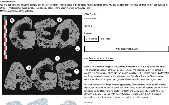
An experimental all-caps display typeface by Lena Weber, built from around 20,000 anchors per glyph to simulate the physical complexity of geological stone samples.
About
Each glyph carries approximately 20,000 anchors, creating a dense, stone-like texture that pushes the limits of what a digital typeface can encode. The family ships with two to four contextual alternates per letter, activated automatically via OpenType features to prevent repetition across a composition. Best suited to posters, album artwork and editorial layouts where it can be set large enough for the detail to read.
Classification
GEO is a display typeface with heavily textured, stone-like letterforms built for high-impact use at large sizes; its extreme visual complexity and geological inspiration place it firmly in the experimental display category.