David
A is for · Emilie Rigaud
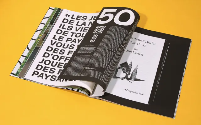
A wide-proportioned sans-serif with squarish counters and a true italic, drawn from a 1969 lettering book by David Gates and refined into a six-weight family.
About
Originating from a sample alphabet published by David Gates in 1969, the design was adapted by Emilie Rigaud with wider proportions and more squarish counters before growing into a full family of six weights from Extralight to Heavy. Rather than a simple slanted oblique, the italic was developed as a true italic with distinct shape changes and deeper junctions. The family has found a consistent home in editorial and magazine work, including Papiers France Culture, Entorse and Girls like us.
Classification
David displays wide proportions, squarish counters and a true italic with distinct shape changes, characteristics consistent with humanist sans-serif design rather than geometric or grotesque conventions.