A neo-grotesque sans derived from a 1965 VGC Solitaire specimen, offering three weights with obliques and a generous x-height suited to both body and headline use.
About
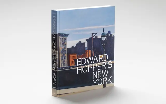
Drawn from John W Denzler's Solitaire, originally published by Visual Graphics Corporation in 1965, Friedel takes the phototype era's monoline forms and gives them a large x-height that reads clearly at text and display sizes. Three weights run from Regular to Bold, each with a matching oblique, covering a broad range of Latin-script languages. The typeface has been used in projects for the Whitney Museum of American Art and Riposte magazine, demonstrating a practical range across cultural and editorial contexts.
Classification
Explicitly described as a neo-grotesque, monoline sans serif; derived from the 1965 VGC Solitaire specimen by John W Denzler, placing it firmly in the mid-century grotesque tradition.