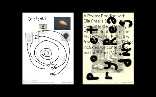
A decorative neo-grotesque revival drawing from an 1897 American Type Founders typeface, distinguished by squared angles that lend it a mechanical edge.
About
Rooted in a typeface family first advertised by the American Type Founders Company in 1897, Lining reinterprets its source material through squared letterform angles that read as distinctly digital despite the nineteenth-century origin. The family is minimal in scope, offering Regular and Regular Oblique only, but the character of individual forms makes it suited to poster and editorial contexts where a single weight can carry weight. The squaring of certain angles is the defining design decision, pulling the face away from conventional neo-grotesque softness into something more mechanical.
Classification
Described explicitly as a decorative neo-grotesque sans-serif, with squared angles on certain letterforms giving it a mechanical, digital character despite its nineteenth-century origins.