Comply Slab
slabgeometric slabitalic
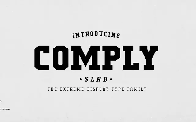
A nine-weight slab serif inspired by skate culture, built for headline use across editorial, apparel and poster work.
About
Named after the skateboard trick the No Comply, this slab serif family runs from Thin to Black with a matching italic for each weight. The design leans geometric, with sharp default glyphs for R and S and alternate chamfered versions available via OpenType stylistic sets. Coverage spans Latin Extended, making it serviceable across Western European languages.
Classification
A slab serif with sharp, geometric construction and pronounced serifs, positioned as a display-oriented family with strong stroke contrast and distinctive alternate glyphs inspired by action sports aesthetics.
Weights
ThinExtra LightLightRegularMediumSemi-BoldBoldExtra BoldBlack
Languages
LatinLatin Extended
Tags
slabdisplaysportseditorialheadlinegeometricboldposter