Name Sans
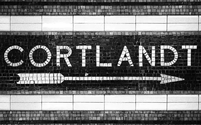
A grotesque sans drawn from the tile mosaic lettering of the New York City subway, developed over four years into a variable type system spanning 72 static styles across optical sizes.
About
The letterforms originate in the idiosyncratic hand-laid tile name tablets found across NYC subway stations, where geometric construction meets grotesque conventions with optical corrections either exaggerated or absent entirely. ArrowType has harmonised these station-to-station variations into a coherent system with Display, Standard and Text optical sizes, a weight axis running from 1 to 1000, and a full italic. A monospaced variant, AT Name Mono, extends the family further, and an extensive set of OpenType alternates covers everything from rectangular uppercase to double-storey g and single-storey a.
Classification
Derived from the tile mosaic lettering of the New York City subway, the design blends geometric construction with grotesque optical quirks, placing it firmly in the grotesque sans tradition with a distinct vernacular character.