Bet
Bal Foundry · Guillaume Sbalchiero · 2023
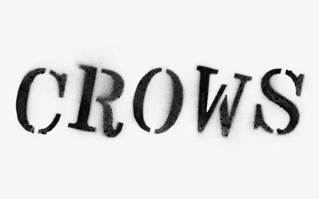
A single-weight display typeface revived from an undated 1920s wood-type poster specimen held at the Museum of Printing in Lyon, drawn by Guillaume Sbalchiero.
About
Derived from three surviving documents attributed to the Jacoby & Fils printing house in Grenoble, Bet blends nineteenth-century Italian poster letterforms with Art Nouveau tendencies into a single Bold weight built for display and identity work. Its organic, monumental proportions reward mixed-case setting, a quality notably exploited in the logotype and generic pages of Revue Diorama. With over 400 glyphs, extended Latin coverage and several stylistic alternates, the font carries enough variation to reward close attention at large sizes.
Classification
Derived from 1920s wood-type poster specimens, Bet carries the monumental weight and eccentric contours of nineteenth-century display letterforms with Art Nouveau inflections, making it squarely a display typeface.