NixonScript
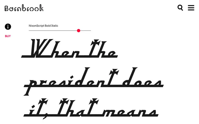
A two-weight display typeface drawn from 1960s American vernacular lettering, transformed into a low x-height serif with an ecclesiastical character and named after Richard Nixon.
About
Beginning as a tracing of lettering found on a 1960s camera from a Chicago junk shop, NixonScript diverged considerably during development, shifting from sans-serif origins to a serifed form with a low x-height and a quality described by Barnbrook as ecclesiastical piousness. Rather than a regular and italic pairing, the family offers a regular alongside a bold italic, with the double emphasis giving the latter an energetic, self-congratulatory character. The name references Nixon's resignation and what Barnbrook frames as a parallel abuse of typographic freedom in the design process.
Classification
Described as a display typeface with serif characteristics, low x-height and an ecclesiastical quality that emerged from a transformation of original sans-serif vernacular lettering. The italic bold variant and expressive form place it firmly in the display category.