Sarcastic
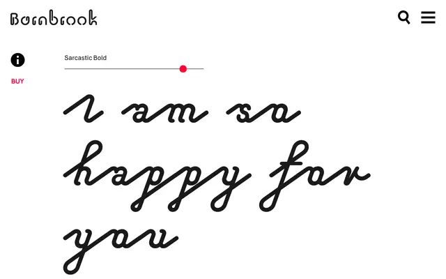
A monoline display typeface rooted in 1950s phototypesetting scripts and the interlocking rhythms of mid-century neon signage.
About
Sarcastic takes its formal cues from two postwar phenomena: the explosion of script typography enabled by phototypesetting in the early 1950s, and the heyday of elaborate neon signage across American towns and cities. The monoline construction echoes the continuous tube of a neon sign, while the letterforms reference the overlapping, rhythmic quality that phototypesetting made possible. Barnbrook frame the name around an inherent duality, where script's elegant appearance sits in tension with an ironic undertone.
Classification
Classified as display due to its monoline construction and decorative intent; it draws from 1950s script typography and neon lettering rather than functioning as a conventional script face.