Ampere
Black Foundry · Ben Hartley, Solenn Bordeau
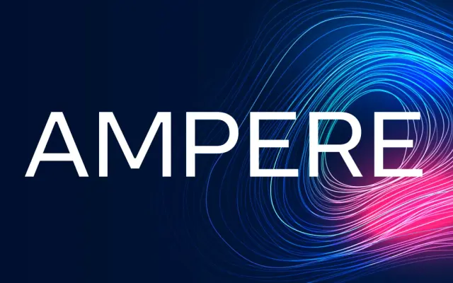
A geometric sans built on grid-like precision with squared ink traps and special "electric" ligatures across six weights, available as a variable font.
About
Designed by Ben Hartley and Solenn Bordeau, Ampere takes a modular, grid-based approach to geometric sans construction, with squared ink traps that ease the sharpest angles into something readable at small sizes. Six weights run from Extra Light to Black, all available within a single variable font. A set of custom "electric" characters and stylistic ligatures give the family a distinct technical character without overplaying the concept.
Classification
Ampere is built on grid-like geometric construction with squared ink traps and clean angles, placing it firmly in the geometric sans tradition. Its structural precision and modular approach are characteristic of the subcategory.