Blaacck
Black Foundry · Jérémie Hornus, Solenn Bordeau
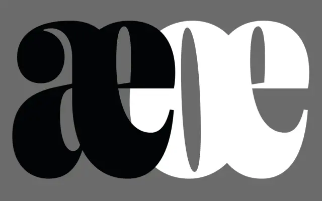
A tightly condensed display serif derived from Vesterbro Poster, with ball terminals and high contrast, designed for an Aaron Levin and AACC rebrand.
About
Built on Vesterbro Poster but reworked with increased stroke contrast, ball terminals and tighter spacing, the face carries a Lubalin-influenced flavour suited to bold editorial and branding headlines. A tall x-height and thin accents allow for extremely compact setting, while ligatures, ornamental punctuation, arrows, stylistic alternates and a comprehensive set of fractions extend its typographic range. Available as a single Poster weight, it is unambiguously a headline tool rather than a text face.
Classification
A tightly condensed, high-contrast serif built exclusively for large-scale headline use, with ball terminals and ornamental details derived from Lubalin-influenced American display type.