Caesura
Black Foundry · Ben Hartley, Solenn Bordeau
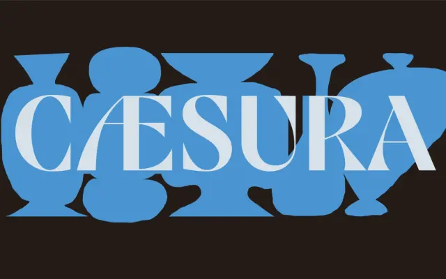
A high-contrast display face drawing on mid-century European signage and Japanese calligraphy, available in a single bold weight with swashes and knife-edged strokes.
About
Designed by Ben Hartley and Solenn Bordeau at Black Foundry, it merges the structural logic of European painted lettering with the expressive stroke weight of Japanese brush calligraphy. Exaggerated thick-thin contrasts, swash characters and sharp terminal cuts give it a strong visual presence at large sizes. The family ships as a single Bold style with broad Latin coverage and a range of OpenType features including discretionary ligatures, oldstyle figures and stylistic sets.
Classification
A single-weight display face with extreme stroke contrast, swashes and knife-edged terminals drawn from mid-century European signage and Japanese calligraphy. Its expressive, decorative character places it firmly in the display category.