slabgeometric slab serifcondenseditalic
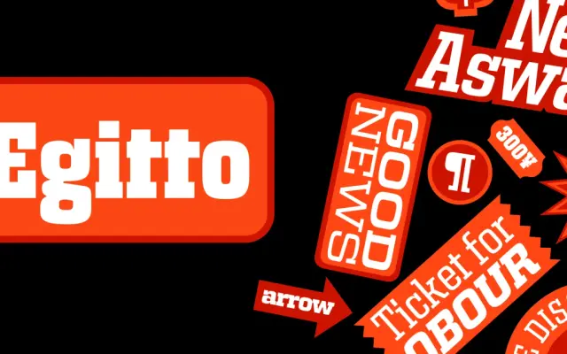
A slab serif drawn from Italian vernacular signage, offered across six widths and five weights with a three-axis variable font.
About
Rooted in the lettering of Italian shopfronts and signs, the design keeps contrast low and construction precise, lending it a mechanistic quality that sits comfortably in branding, packaging and corporate contexts. The middle range of weights holds at smaller sizes, while the broader widths and heavier cuts open it up for display use. The full family spans sixty static styles plus a variable font covering weight, width and italic axes.
Classification
Low-contrast letterforms with slab serifs drawn from Italian vernacular signage tradition; mechanistic construction places it firmly in the geometric slab category.
Weights
Extra LightRegularMediumBoldExtra Bold
Optical sizes and widths
CondensedStandardSemi ExtendedExtendedWideSuper Wide
Languages
Latin
Tags
slabgeometricitalian-vernacularvariablewide-familybrandingpackagingdisplay