Gal Gothic Narrow
Blackletra · Daniel Sabino · 2024
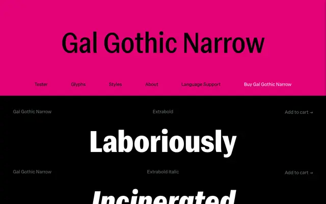
A narrow grotesque drawn from Franklin Gothic's lineage, reworked by Daniel Sabino to carry moderate stroke contrast consistently across all weights.
About
Where Morris Fuller Benton's Franklin Gothic reserved its characteristic stroke contrast for heavier weights, Gal Gothic Narrow redistributes that tension throughout the full range from Light to Extrabold, giving the family a more coherent system. Horizontal stroke endings and smooth junctions between vertical and curved stems push the design toward neo-grotesque territory, while round dots add a distinct tone. Each font carries around 900 glyphs, a variable version with weight and width axes, and OpenType features including small caps, tabular and oldstyle figures.
Classification
Inspired by Franklin Gothic, Gal Gothic Narrow extends that grotesque lineage with neo-grotesque refinements such as horizontal stroke endings and round dots, placing it firmly in the grotesque sans-serif tradition.