Gothiks
Blackletra · Daniel Sabino · 2016
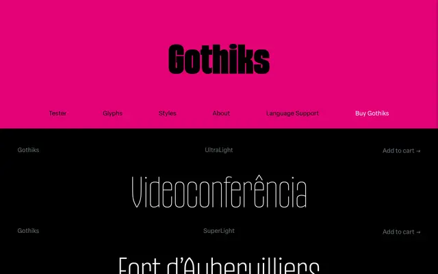
A six-weight display sans by Daniel Sabino that borrows the vertical rhythm of Textura blackletters to give its diagonal strokes an unusually upright, condensation-friendly structure.
About
Where most sans-serifs use angled diagonals, Gothiks makes all diagonal strokes vertical on letters such as A, N, M, K, V, W, X, Y and Z, a structural decision lifted directly from Textura blackletter tradition. That verticality makes the typeface accept condensation naturally, which explains the existence of companion Condensed and Compressed families. The character set is extensive, covering a large range of Latin languages, and OpenType features include fractions, small capitals and multiple figure sets, with default figures aligned to the lowercase.
Classification
Classified as display because the foundry explicitly describes it as a display sanserif; its vertical diagonal strokes, derived from Textura blackletter rhythm, give it a distinctly decorative personality suited to large sizes rather than text use.