Gothiks Compressed
Blackletra · Daniel Sabino · 2016
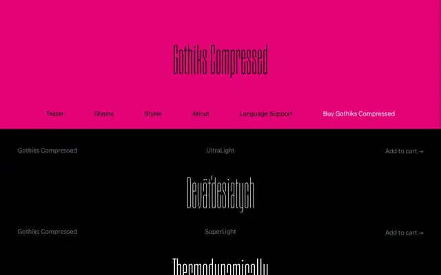
A compressed display sans by Daniel Sabino that pulls its vertical rhythm from Textura blackletter, rendering all diagonal strokes as upright verticals across six weights.
About
Designed by Daniel Sabino in 2016, the family draws on the verticality of Textura scripts to create a compressed sans where diagonals in letters like A, N, M and V are resolved as strict verticals. This structural decision makes extreme condensation feel organic rather than forced, giving the family a distinctive character suited to editorial headlines and display work. The typeface ships with an extensive OpenType feature set including small capitals, multiple figure styles, fractions and broad Latin language coverage.
Classification
A display sans-serif with compressed proportions and vertical diagonal strokes derived from Textura blackletter, giving it a distinctive upright rhythm that sets it apart from conventional grotesques.