Gothiks Condensed
Blackletra · Daniel Sabino · 2016
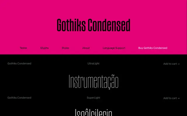
A six-weight condensed display sans by Daniel Sabino that channels the vertical rhythm of Textura blackletter into a sanserif structure, turning diagonal strokes upright throughout the alphabet.
About
Designed by Daniel Sabino and released in 2016, Gothiks Condensed applies a defining formal rule: wherever a diagonal stroke would normally appear, it is made vertical instead. Letters such as A, M, N, K, V, W, X, Y and Z all follow this treatment, giving the family a striking uniformity that accepts condensation naturally. The result sits between sanserif and blackletter traditions, a relationship the name makes explicit, since 'Gothic' refers to both depending on geography.
Classification
A condensed display sans-serif with diagonal strokes rendered vertically throughout, drawing on the rhythmic verticality of Textura blackletter while remaining entirely within the sans-serif tradition.