Noka
Blackletra · Daniel Sabino · 2017
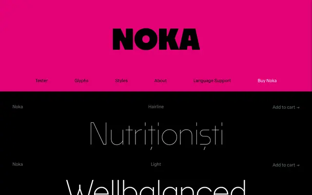
A clean geometric sans by Daniel Sabino with a digital and technological character, notable for its narrowed F, T and L and parallel diagonal strokes on V, W and A.
About
Designed by Daniel Sabino and released in 2017, Noka is a geometric sans-serif whose letter construction references digital and technological aesthetics. Its six weights run from Hairline to Black, offering good tonal range for both display and interface work. The deliberately narrowed F, T and L, alongside the parallel diagonals in V, W, A and their lowercase equivalents, give the family a distinct underlying rhythm rather than standard geometric uniformity.
Classification
Noka is explicitly described as a geometric sanserif with structural references to digital and technological contexts; parallel diagonal strokes and narrowed letters confirm a geometric construction approach.