Silva Display
Blackletra · Daniel Sabino · 2015
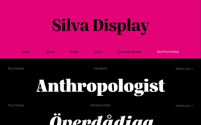
A display-optical serif from Daniel Sabino with slightly condensed proportions and eight weights, designed for editorial contexts demanding typographic range.
About
Part of the Silva superfamily alongside Silva Text, the Display cut offers 16 styles across eight weights from Extralight to Ultrablack, each with a matching italic. Slightly condensed proportions, a generous x-height and moderated ascenders and descenders make it economical on the page without sacrificing readability at larger sizes. The character set is extensive, covering old-style and lining figures, tabular variants, fractions, ligatures, small capitals and broad Latin language support.
Classification
Silva Display is a serif with slightly condensed proportions, robust serifs and a generous x-height, characteristics consistent with a transitional serif designed for editorial display use.