Bilo
Bold Monday · Pieter van Rosmalen, Anna Khorash, Lora Shtirkova · 2018
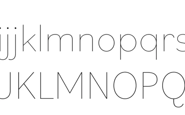
A grotesque sans with egg-shaped rounds and unusually steep italics, rooted in Pieter van Rosmalen's early attempts to draw a low-contrast sans-serif version of Bodoni.
About
Van Rosmalen began exploring the forms in 2014, and the Bodoni black 'o' that started it all still shows in the oblong counters of heavier weights and the slightly concave stem terminals. Nine weights run from Hairline to Black, each with steep italics that lean further than is typical for a sans, and proportions shift from slender lights to wider, stubbier blacks. An extensive set of OpenType alternates, including a single-storey 'a' and multiple 'f' variants, lets the typeface move between grotesque and geometric registers without changing fonts.
Classification
A grotesque sans-serif with deliberate departures from convention, including egg-shaped rounds in heavier weights and steep italics that trace influence from Bodoni rather than traditional sans-serif models.