Brando
Bold Monday · Mike Abbink, Aleksandra Samuļenkova · 2012
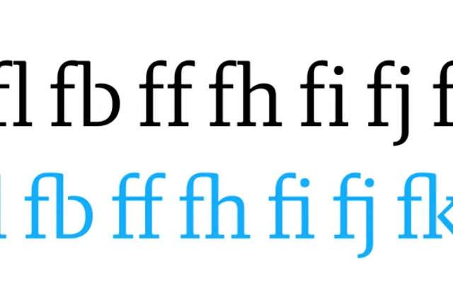
A contemporary humanist slab serif by Mike Abbink and Aleksandra Samuļenkova that moves between Egyptian rigidity and fluid stroke work across eight weights from Hairline to Black.
About
Originally prompted by a bank logotype proposal, Brando developed into a full text and display family that balances mechanical structure with open, humanist letterforms. Lighter weights carry the character of an elegant slab serif while heavier cuts introduce contrast for comfortable text setting. The italics occupy a deliberate middle ground between true italic and oblique, and the family covers over forty languages across an extensive Latin and Cyrillic character set. It received a Judge's Choice Certificate of Typographic Excellence from the Type Directors Club in 2015.
Classification
Brando sits between humanist proportions and Egyptian slab forms, with lighter weights reading as open slab serifs and heavier weights introducing contrast. The foundry describes it as exploring the balance between mechanical and Egyptian forms, placing it firmly in the humanist slab category.