Flex
Bold Monday · Paul van der Laan · 1999
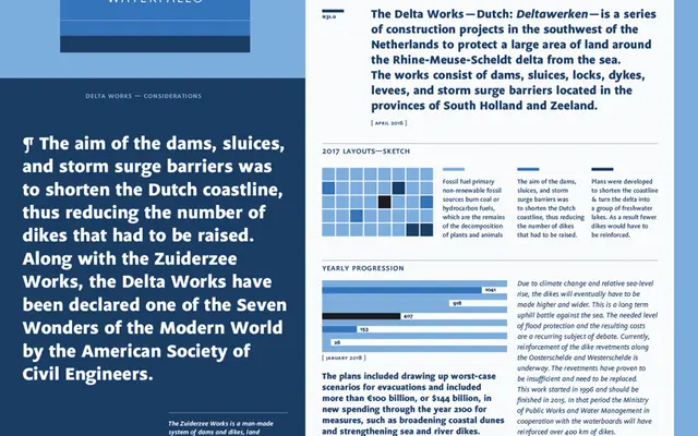
A humanist sans by Paul van der Laan, originally conceived in 1999 as a multi-purpose family with strong small-size legibility and wayfinding credentials.
About
Designed with open letterforms and economic proportions, Flex performs at small text sizes as readily as it does in bold headlines and signage contexts. Five weights, each with a true italic, are accompanied by small caps, oldstyle figures and ligatures, giving the family the typographic tools expected of a refined text face. Its space-saving proportions make it particularly well suited to wayfinding systems where positive and negative applications must both hold up.
Classification
Flex has open letterforms, true italics, small caps and oldstyle figures suggesting a humanist sans-serif orientation. Its economic proportions and legibility at small sizes align with the humanist sans tradition.