Goldich
Bold Monday · Jasper de Waard · 2022
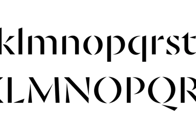
A sharply angular display serif by Jasper de Waard, its letterforms shaped by a weathering metaphor that produces stencil-like cuts best seen at large sizes.
About
Designed over several years by Jasper de Waard and named after a geological classification of mineral weathering, the family draws on that idea to create characters whose thin strokes appear worn away into precise, crystalline angles. Five weights from Regular to Black each come with italics, and the italics introduce their own elegant quality for mixed-case text. OpenType features cover alternates for a, g and the ampersand, alongside a full range of numeral styles and fractions, with coverage across more than 100 Latin-script languages. It received a Type Directors Club Certificate of Typographic Excellence in 2022.
Classification
Goldich features sharply cut, angular letterforms with thin parts deliberately weathered away into stencil-like shapes, making it a display serif designed primarily for large-size settings and all-caps use.