Merwede
Bold Monday · Titus Schulz · 2024
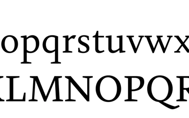
A humanist text serif by book designer Titus Schulz, distinguished by unconventional details including upright italic capitals and a full set of musical chord symbols.
About
Designed by Titus Schulz, a book designer with 25 years of experience, Merwede is rooted in calligraphic practice and draws loose inspiration from early Renaissance type and designers including Fournier, Gill and Van Krimpen without reviving any single model. The family runs across four weights — Regular, Firm, Medium and Bold — each with italics, where Firm sits between Regular and Medium and is intended for posters, reversed-out text and inscriptions. A full set of musical chord and notation symbols addresses a longstanding gap Schulz identified across existing book typefaces.
Classification
Merwede draws on early Renaissance typefaces and the work of Fournier, Gill, Van Krimpen and Majoor, giving it a humanist character rooted in calligraphic tradition and book typography rather than strict historical revival.