Nitti Grotesk Condensed
Bold Monday · Pieter van Rosmalen · 2019
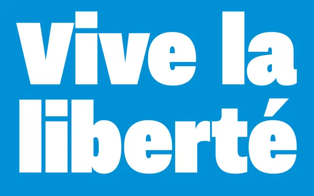
A condensed companion to Nitti Grotesk by Pieter van Rosmalen, built across twelve weights for headlines, navigation and advertising.
About
Where Nitti Grotesk favours generous, rounded proportions, this condensed variant trades those curves for squarish, oval forms that read as tighter and more urgent. Twelve weights run from Hairline to Ultra, with italics covering Light through Black, giving editorial and corporate designers a wide palette for high-impact display work. It pairs naturally with Nitti Grotesk but holds its own alongside other typefaces in condensed-column or breaking-news contexts.
Classification
A condensed grotesque sans with squarish, oval forms derived from the wider Nitti Grotesk family, designed for display and headline use with an urgent, restrained character.