Oskar
Bold Monday · Paul van der Laan · 2002
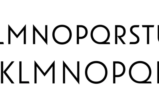
An all-caps display series by Paul van der Laan rooted in early 20th-century Dutch architectural and sign-painted lettering, offered in two stylistic flavours each with inline variants.
About
Originally drawn in 2002 for the restoration lettering of a Jan Duiker school building in The Hague, Oskar has since grown into twelve styles across two subfamilies. Oskar One retains the pointy apices and expressive irregularity of 1920s Dutch lettering manuals, while Oskar Two pulls the forms closer to classical geometric sans whilst preserving an Art Deco sensibility. Each weight in both subfamilies is paired with a manually hinted inline variant suited to façade work, titling and screen use alike.
Classification
An all-caps display type series drawing on early 20th-century Dutch architectural and commercial lettering traditions, blending geometric sans structure with Art Deco characteristics. Its origins in sign painting and lettering manuals rather than printing type distinguish it from conventional geometric sans-serifs.