Panno Sign
Bold Monday · Pieter van Rosmalen · 2008
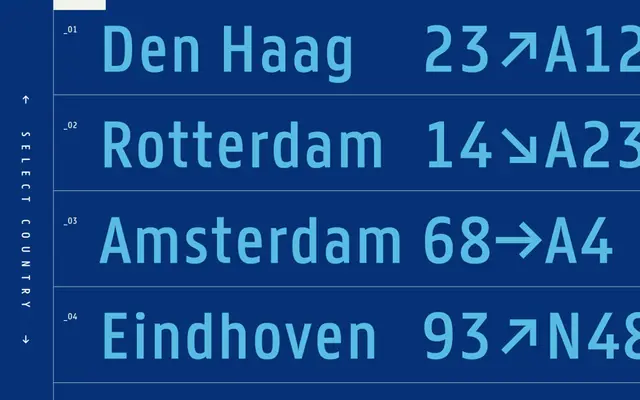
A signage-optimised sans by Pieter van Rosmalen, originally developed for romanised street name signs in South Korea.
About
Designed between 2008 and 2010 to handle tri-script Korean street signs where Latin, Korean and Chinese characters share limited space, Panno Sign uses narrow proportions, an oversized x-height and open counters to maintain legibility under compression. The family comes in Normal and Rounded variants, each offered in Positive and Negative cuts to maintain consistent optical weight across light-on-dark and dark-on-light applications. An extended Latin character set covers a wide range of languages, with OpenType alternates for 'a', 'g' and the ampersand.
Classification
Designed for wayfinding and signage with narrow proportions, large x-height, and open counters; minimal stroke contrast places it in the humanist sans tradition, optimised for legibility at distance.