Panno Text
Bold Monday · Pieter van Rosmalen · 2008
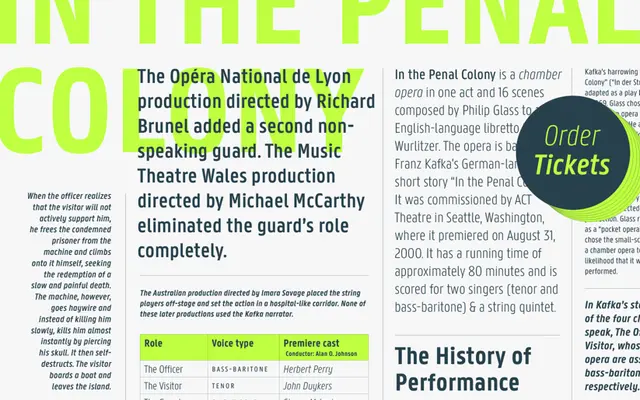
A text-optimised reworking of Panno Sign by Pieter van Rosmalen, with narrow proportions, a large x-height and true italics across six weights.
About
Derived from Panno Sign, this family adjusts letterforms and completely reworks the spacing to hold up at small sizes in continuous text. The narrow proportions and open counters make it practical for editorial, exhibition and corporate environments where DIN-style constructed sans-serifs feel too cold. Six weights from Light to Bold each come with matching true italics, and OpenType features cover fractions, multiple numeral styles and stylistic alternates for 'a', 'g', 'y' and the ampersand.
Classification
Narrow proportions, large x-height, open counters and minimal stroke contrast place it firmly in the humanist sans tradition, with functional clarity akin to DIN but warmer in character.