Pim
Bold Monday · Pieter van Rosmalen · 2025
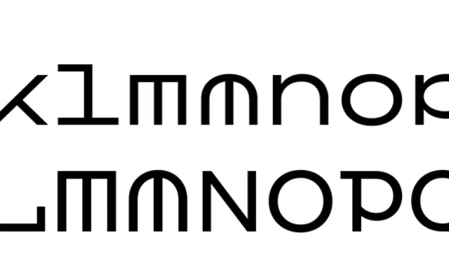
A display typeface rooted in Dutch mid-20th century glass shop-window lettering, with monospaced square construction, ball terminals and an elaborate set of swashes, ornaments and pictograms.
About
Originally designed for letterpress printing using polymer and wood type, Pim digitises the wide, round aesthetic of Dutch 'Pootjesglas' etalage lettering associated with Johannes Willem 'Pim' Pootjes. All glyphs sit on a square grid with an extremely high x-height and no descenders, allowing very tight setting with no leading. Three weights plus an inline style cover extended Latin and Cyrillic, while clip-on swashes, Art Deco alternates, manicules, emoji and goggle-eyed umlauts extend the repertoire well beyond the original analogue capitals.
Classification
Pim is a display typeface rooted in Dutch mid-20th century glass advertising lettering, with wide round forms, monospaced construction, ball terminals and an inline variant. Its origin in letterpress printing and its decorative feature set place it firmly in the display category.