Quinn
Bold Monday · Diana Ovezea · 2013
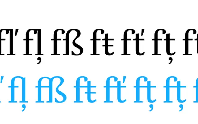
A two-subfamily serif by Diana Ovezea, split into Text and Display optical sizes, drawn in the tradition of Fleischmann's realist serifs with high stroke contrast and pronounced ink-traps.
About
Developed between 2013 and 2019 beginning at the Type and Media course at KABK in The Hague, Quinn comprises 24 styles across Quinn Text (10 styles, optimised for 6–24pt) and Quinn Display (14 styles, for sizes above 24pt). Display styles carry slightly shorter ascenders and descenders to enable tighter, more impactful settings, while top serifs align with the x-height for strong horizontal rhythm. A thorough OpenType feature set including small caps, multiple numeral sets, ligatures and ordinals makes it well suited to complex publication hierarchies.
Classification
Quinn draws explicitly on realist (transitional) serif models such as Johann Fleischmann's work, with high stroke contrast and vertical stress, stopping short of full Didone rigidity. The family sits squarely in the transitional tradition, updated for contemporary publishing use.