Rigby
Bold Monday · Pieter van Rosmalen · 2023
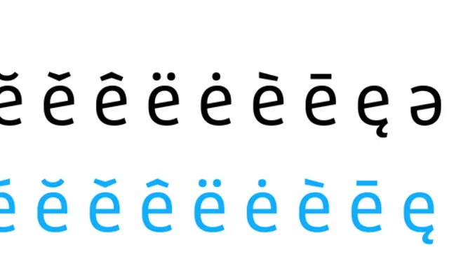
A deliberately compact two-weight sans-serif by Pieter van Rosmalen, derived from a custom typeface made for Dutch public broadcaster NTR, with a monospaced sibling and a RIBBI structure.
About
Designed by Pieter van Rosmalen and released between 2023 and 2025, Rigby offers Regular and Bold with matching italics, kept intentionally simple at a time when many families chase weight counts and variable axes. Its default letterforms include a distinctive double-storey g and a two-storey e with a curved bar, both of which can be swapped out via stylistic sets for more neutral alternatives. The monospaced variant shares the same character and warmth, making the family useful across editorial, UI and coding contexts where a small, coherent system is preferable to a sprawling one.
Classification
A sans-serif with angular terminals and personable letterforms including a distinctive double-storey g and e, rooted in a custom typeface for a Dutch public broadcaster; its warmth and character place it firmly in the humanist sans tradition.