Trio Grotesk
Bold Monday · Florian Schick · 2011
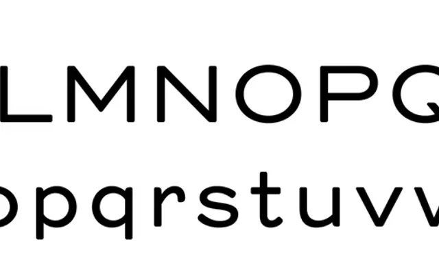
A revival of Kaart Antieke, the early 20th-century sans-serif found in Piet Zwart's unpublished essay on modern typography, preserving the ink-spread character of the original letterpress printing.
About
Florian Schick began this as a student project at KABK Type & Media after discovering the only two surviving copies of Piet Zwart's essay 'Van oude tot nieuwe typografie' at the Meermanno Museum in Den Haag. Working from the original 7 pt printed text, he replicated the printed image with care, retaining the rounded stroke endings and junctions caused by ink spread and pressure rather than normalising them away. The family offers three weights with italics, a broad Latin-extended character set, and OpenType features including multiple numeral sets, arrows, ornaments and dingbats.
Classification
A revival of Kaart Antieke, an early 20th-century sans-serif associated with Dutch modernism; the ink-spread characteristics of letterpress printing preserved in the forms place it firmly in the historical grotesque tradition.