CA Blitzkrieg Pop
Cape Arcona · Thomas Schostok
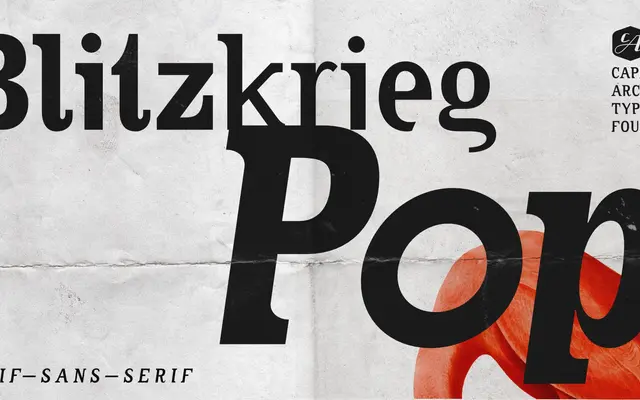
A serif-meets-sans display face by Thomas Schostok rooted in '90s punk zine and DIY gig poster aesthetics.
About
Designed by Thomas Schostok at Cape Arcona, it fuses serif and sans-serif forms to channel the raw energy of grunge-era underground print. Three weights — Light, Regular and Bold — each with matching italics, are complemented by a variable font for continuous weight adjustment. Alternate characters and OpenType features add further latitude, making it suited to headlines, logos and short runs of punchy display text.
Classification
Deliberately blends serif and sans-serif letterforms in a single face, drawing on punk and grunge vernacular; best classed as display given its headline-first intent and raw, expressive character.