CA Cape Rock
Cape Arcona · Thomas Schostok, Stefan Claudius
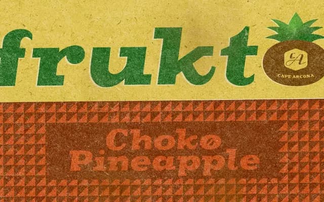
A fat Clarendon display face by Thomas Schostok and Stefan Claudius, built for heavy headlines with gritty, muscular presence and a generous set of OpenType alternates.
About
Rooted in the tradition of nineteenth-century fat Clarendons, CA Cape Rock brings bold, bracketed serifs and a heavy silhouette to display work. Two styles, Regular and Italic, are supported by discretionary ligatures, contextual alternates, swashes and stylistic sets, giving designers room to vary the texture of a headline or logotype. Coverage spans Western and Central European encodings, with 430 glyphs per style.
Classification
Classified as Display by the foundry; draws directly from the fat Clarendon tradition with heavy bracketed serifs and bold silhouettes intended for headline use.