CA Cula
Cape Arcona · Thomas Schostok
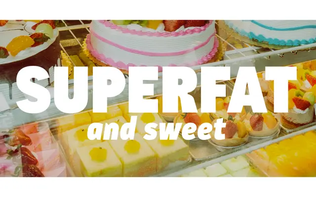
A DIN-inflected sans by Thomas Schostok that replaces industrial rigidity with rounder forms and visible ink traps functioning as both text aid and display feature.
About
Rooted in the cool, utilitarian DNA of industrial faces like DIN, CA Cula introduces rounder, friendlier letterforms that soften the genre's characteristic coldness. Its denaturalized ink traps serve a dual role: at display sizes they read as a deliberate design detail that gives headlines a distinct character; at smaller sizes they perform their original function of preventing ink bleed and maintaining legibility. Five weights from Light to Superfat, each with a matching italic, keep the family lean and practical without the ambiguity of incremental semi-weights.
Classification
Cape Arcona classify it as sans-serif; the design draws on industrial grotesque conventions similar to DIN while introducing rounder, humanist shapes and denaturalized ink traps, placing it between geometric and humanist sans traditions.