CA Emeralda
Cape Arcona · Stefan Claudius
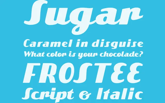
A two-style display script family combining a 1950s advertisement-derived italic with a companion modern script.
About
The italic cut originated from a single headline spotted in an early-1950s industrial advertisement magazine, with Stefan Claudius expanding those few letterforms into a full retro-inflected script. A second style pairs it with a more contemporary script approach, giving the family a small but complementary range. Coverage spans Western encoding at 215 glyphs per style, suited to packaging, editorial headers and retro-themed branding.
Classification
Cape Arcona classify it as Display Script; it combines an italic style drawn from a 1950s industrial advertisement headline with a complementary modern script, placing it firmly in retro display territory.