CA Geheimagent
Cape Arcona · Stefan Claudius
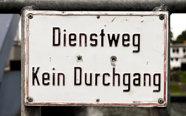
A four-style sans derived from industrial harbour prohibition signage, balancing utilitarian strictness with a dynamic italic.
About
Sitting between text and headline use, CA Geheimagent draws its character from prohibition signs in an industrial harbour context. The upright styles carry a rigid, institutional quality, while the italic cuts forward at an angle and introduces subtle differences beyond mere slant. Four styles cover Regular, Italic, Bold and Bold Italic, with OpenType features including discretionary ligatures, stylistic alternates and tabular figures.
Classification
Cape Arcona classifies it as sans serif; its origin as a prohibition sign in an industrial harbour setting, combined with strict upright uppercase forms and a distinctly angled italic, places it in an industrial sans subcategory.