CA Hail to the King
Cape Arcona · Thomas Schostok
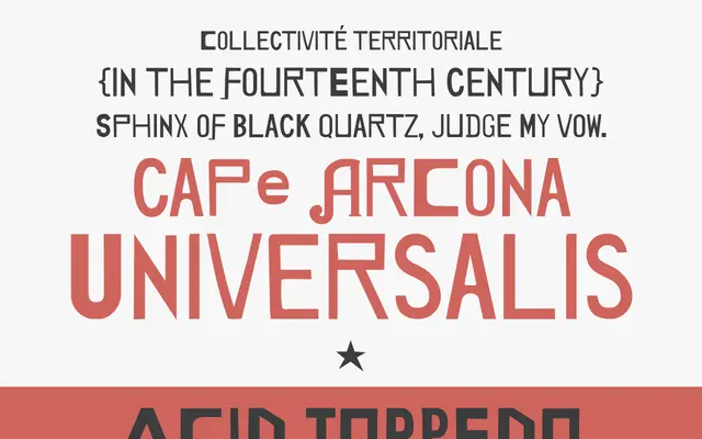
A single-weight display face assembled from handmade signs found across the world, with deliberately mismatched weights between upper and lowercase letters.
About
Drawn from hand-lettered signage sourced globally, the typeface deliberately mixes bold uppercase characters with regular-weight lowercase ones, creating an unpredictable, vernacular rhythm across any setting. It was originally created for an exhibition catalogue tied to the show 'Hail to the King, Baby!', and carries that one-off, found-lettering energy into a usable digital form. The character set spans Western and Central European encodings, with 367 glyphs including stylistic alternates.
Classification
Classified as Display by the foundry; the typeface is drawn from handmade signage letterforms worldwide, with deliberate irregularities in size and weight between cases that place it firmly outside conventional text categories.