CA Magic Hour
Cape Arcona · Stefan Claudius · 2004
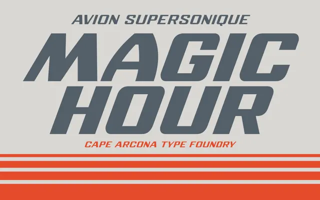
An uppercase-only display face drawn from 1970s Concorde-era optimism, notable for keeping every letter at an identical width across all four weights.
About
Originally released in 2004 and revisited in 2026, CA Magic Hour adds Thin and Black to its original Bold, giving the family four weights from hairline to heavy. The defining feature is fixed character width: switching between Thin, Regular, Bold and Black leaves the text rhythm completely unchanged, an unusual constraint that suits typesetting where layout consistency matters. The face covers Western and Central European encodings and ships as a variable font alongside the four static styles.
Classification
Uppercase-only vintage display face with a modernist, supersonic-era aesthetic. Cape Arcona classify it as Display, and the monospaced-width letterforms across all weights reinforce its geometric, retro-futurist character.