CA Moskow Has A Plan
Cape Arcona · Stefan Claudius
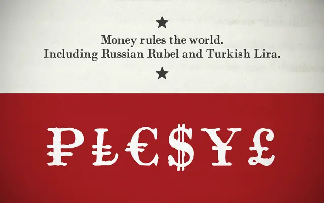
A single-weight distressed serif by Stefan Claudius, designed to replicate the uneven impression of letterpress printing with Cold War-era Russian character.
About
Inspired by an old Russian book about Moscow's plans for world domination, the typeface mimics hand-lettered letterpress work through deliberately varied stroke weights and roughened outlines. At small sizes it reads cleanly as a text font; at display sizes the imperfections become visible and expressive. The character set covers Western Latin, Central European Latin and Cyrillic, and the foundry recommends disabling kerning for a more authentic Cold War print feel.
Classification
The foundry classifies it as a distressed serif. The typeface mimics the imperfect, uneven impression of letterpress printing, with deliberately varied stroke weights and crippled outlines that evoke aged type.