CA Normal
Cape Arcona · Stefan Claudius
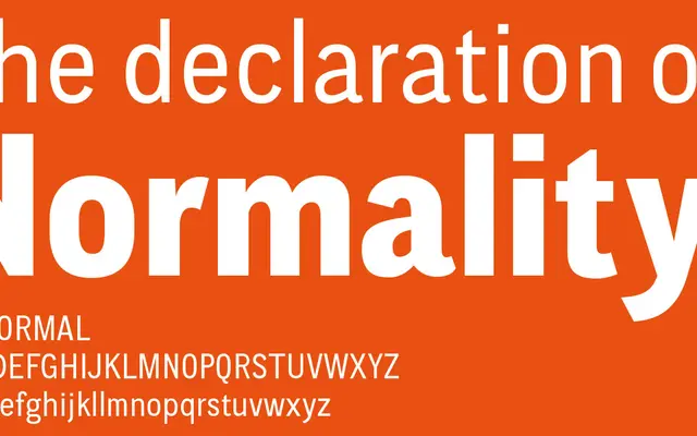
A clean grotesque by Stefan Claudius that blends European and American gothic influences into a near-neutral text face with a few quietly distinctive details.
About
Designed to read without drawing attention to itself, CA Normal keeps its concept firmly in the background while introducing subtle, slightly uneven details that maintain optical rhythm in text. The oblique is slanted from the roman in true grotesque fashion, and a reverse oblique adds a cartographic oddity rarely seen outside map typography. Underneath, the family is well-furnished with small caps, proportional lining figures switchable to old-style or tabular via OpenType, and a Central European character set across 15 styles including a 'Left' sub-family of five weights.
Classification
CA Normal draws explicitly from European grotesques and American gothic traditions, blending both into a neutral, clean sans-serif. The oblique follows grotesque convention rather than a separately drawn italic, reinforcing its grotesque heritage.