CA Normal Serif
Cape Arcona · Stefan Claudius
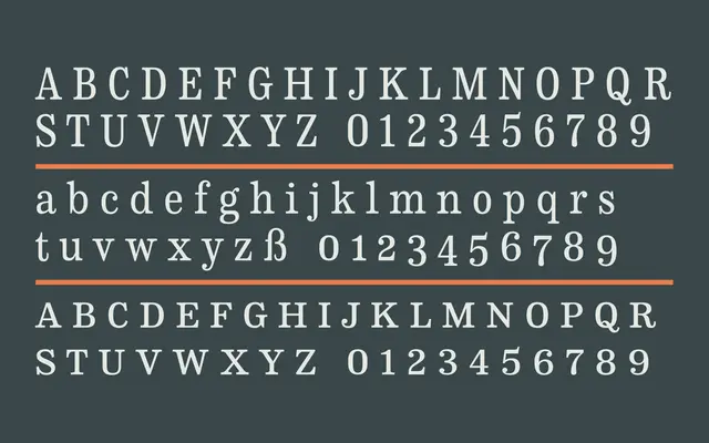
A serif companion to CA Normal that sits between modern and slab-serif traditions, drawing on Griffith's legibility group and scotch roman proportions.
About
Designed by Stefan Claudius as a conceptual match to the grotesque CA Normal rather than a straightforward serif counterpart, it shares proportions and quirkiness without being an obvious relative. The design picks up the abrasive details and slabbish serifs of classic newspaper type in the vein of Chauncey H. Griffith's legibility group, but with more condensed proportions that lend it a scotch-roman elegance. Ten styles run from Regular to Extra Bold, each with a matching italic.
Classification
Positioned by the foundry between modern and slab-serif, with influences from Chauncey H. Griffith's legibility group and scotch romans, placing it in a transitional zone with slab-adjacent detailing and condensed proportions.