CA Postal
Cape Arcona · Stefan Claudius
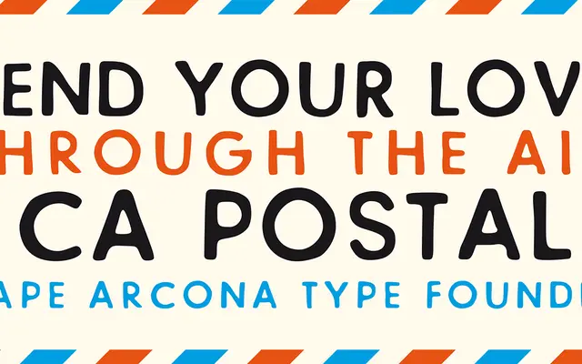
A single-weight stamp-effect display face with contextual alternates that prevent identical characters appearing adjacent, maintaining an authentic rubber-stamp irregularity.
About
Designed by Stefan Claudius and originally created for a record cover, CA Postal draws its inspiration from moveable stamp printing sets with a Futura-adjacent geometric quality. The irregular outlines are its defining trait, and two sets of characters combined with the Contextual Alternates OpenType feature ensure no two identical glyphs sit side by side. At 450 glyphs, it covers Western and Central European encodings with discretionary ligatures and stylistic alternates alongside the core alternates logic.
Classification
Classified as distressed by the foundry; the irregular, stamp-like outlines and contextual alternates place it firmly in the display category, evoking moveable rubber stamp printing sets rather than any conventional text type genre.