CA Rough Rider
Cape Arcona · Stefan Claudius
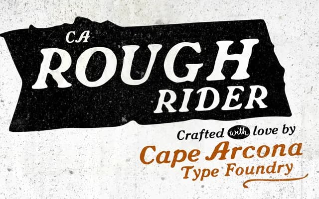
A single-weight bold italic display face with a rough, worn texture, originating from a one-off logo commission and expanded to cover Western and Central European character sets.
About
Designed by Stefan Claudius, CA Rough Rider began life as a bespoke logotype before being extended into a full typeface. The rough, hand-drawn quality carries through at display sizes without becoming illegible at smaller settings. With 341 glyphs and OpenType stylistic alternates, it supports Western and Central European encodings and suits title work, branding and editorial headlines where grit is the point.
Classification
A bold italic display typeface with a deliberately rough, worn texture; Cape Arcona classify it as Distressed, and its single-weight italic construction is built entirely for headline and logotype use.