CA Spotnik
Cape Arcona · Stefan Claudius
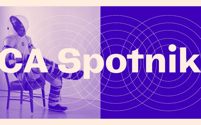
A wide grotesque with slight contrast, drawn from a hand-lettered title card in an early Tarkovsky film, with a distinctive swirly alternate 's'.
About
Inspired by a hand-drawn title sequence from an early Andrei Tarkovsky film, CA Spotnik is a grotesque sans with subtle stroke contrast and wide, generous proportions built around a large x-height. The family spans six weights from Thin to Extrabold, each with a matching italic, and grows progressively wider as the weight increases. A variable font is included alongside the static styles, and a standard 's' is available via stylistic sets for those who prefer to skip the signature swirling alternate.
Classification
Classified as sans serif by the foundry, with slight stroke contrast and wide proportions; the hand-drawn inspiration and quirky details place it firmly in the grotesque tradition.