CA Telecopy
Cape Arcona · Thomas Schostok
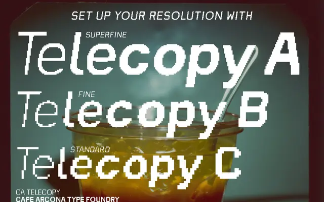
A deliberately degraded display typeface that reproduces the pixelated distortion of early 1990s fax machines and CRT monitors across three quality levels and four weights.
About
Designed by Thomas Schostok, CA Telecopy comes in three subfamilies, A, B and C, each simulating a different pixel resolution at 40, 24 and 15 pixels respectively, giving twelve styles in total across Light, Regular, Medium and Bold. The glitch aesthetic is treated as an intentional design choice rather than a flaw, drawing on the visual language of early internet artefacts and analogue-to-digital degradation. With 554 glyphs per style and support for Latin Extended and Central European encodings, it suits editorial, branding and screen work where retro digital noise is the point.
Classification
Classified by the foundry as Techno Display; the typeface deliberately mimics pixelated, glitched output from early 1990s fax machines and low-resolution monitors, placing it firmly in the display category with a distressed digital aesthetic.