CA Yoshiro
Cape Arcona · Thomas Schostok
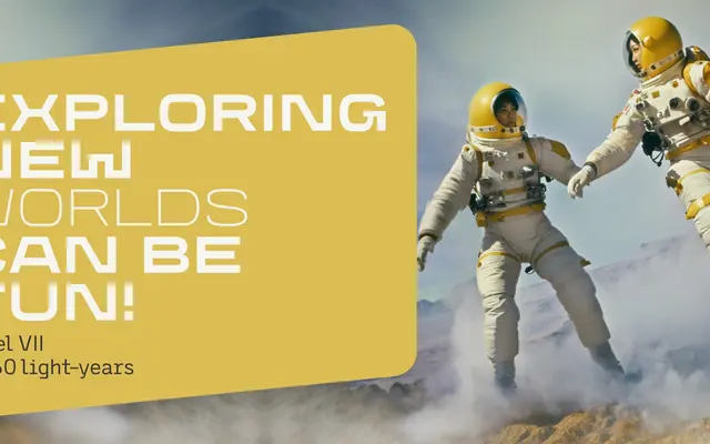
A squared geometric display family by Thomas Schostok, positioned as a contemporary alternative to Eurostile and Microgramma for sci-fi, action and military titles.
About
With ten styles split across Normal and Wide subfamilies, CA Yoshiro offers designers the range of letter widths that Eurostile users historically had to fake through distortion. A variable font is included, allowing continuous width and weight adjustment within a consistent design. The Normal styles are legible enough for body text use, while the Wide styles replicate the extended proportions of Eurostile Extended for genre-appropriate headlines and titles.
Classification
Classified by the foundry as Sans Serif Display Techno; the design draws directly from the Eurostile and Microgramma lineage, featuring squared geometric letterforms associated with sci-fi and military visual language.