CA Zentrum
Cape Arcona · Thomas Schostok
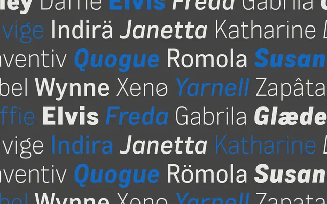
A five-weight grotesque sans in three widths, designed by Thomas Schostok with rounder forms that ease reading at smaller sizes without sacrificing a bold, distinct character.
About
Thirty styles span five weights from Light to Black across Normal, Condensed and Wide widths, each with matching italics, plus a variable font. The rounder internal shapes soften what would otherwise be a fairly assertive grotesque, making it workable for body text and editorial layouts as well as headlines. Glyph coverage extends to over 100 Latin languages and Cyrillic, with a strong OpenType feature set including old-style figures, fractions and contextual alternates.
Classification
Classified as sans-serif by the foundry; the combination of bold, distinct letterforms with rounder shapes and tight spacing places it firmly in the grotesque tradition, with a contemporary geometric inflection.