Afronaut PRO
Capitalics · Mateusz Machalski
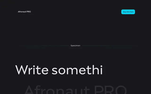
A geometric display typeface drawing on vernacular Latin and Arabic signage from West Africa, with multiple alternate letterforms per character.
About
Designed by Mateusz Machalski of Capitalics, Afronaut PRO blends geometric construction with rounded, organic elements pulled from vernacular typography encountered across Senegal, Mauritania, Guinea-Bissau and Gambia. Each letter may carry up to three alternate forms, giving typographers room to vary rhythm and texture within a single weight. The family spans seven weights from Thin to Bold and is positioned as a companion to the foundry's Yalla typeface.
Classification
Geometric forms contrasted with smooth, round elements drawn from vernacular Arabic and African lettering traditions; the hybrid visual language and multiple alternate forms place it firmly in the display category.