Alergia
Capitalics · Mateusz Machalski
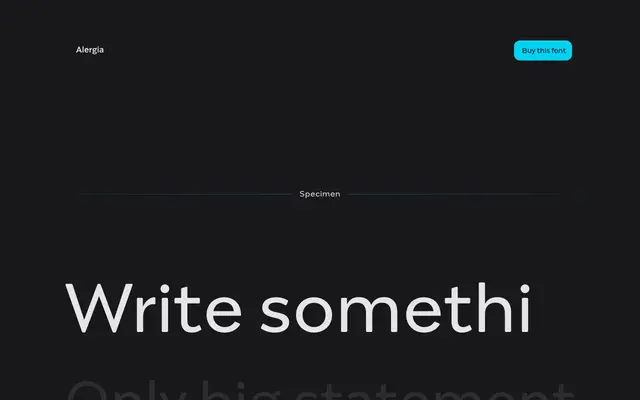
A 60-style geometric grotesque with linear antiqua influences, notable for its idiosyncratic letter cuts and three-width system spanning Condensed to Extended.
About
Built across 10 weights, three widths and matching italics, the family blends geometric grotesque construction with the subtle stroke contrast of a linear antiqua. Distinctive details include unconventional cuts on 'a' and 's' and a double-storey 'g', giving the typeface a character that separates it from more neutral geometric grotesques. Script coverage extends to Vietnamese, extended Cyrillic with Abkhazian support, and Greek.
Classification
Described by the foundry as a hybrid between a classical geometric grotesque and a linear antiqua, with delicate contrast and distinctive letterform details such as a double-storey g and idiosyncratic cuts on 'a' and 's'.